ORI REPORTS & FLYER
DIGITAL & PRINT
The Massachusetts Office for Refugees and Immigrants (ORI) is a state-funded organization that mainly serves the community of refugees and immigrants in terms of supporting and providing helpful resources ranging from "economic, social, and civic life in Massachusetts." ORI has been a faithful Office delivering outstanding services to a diverse network of all newcomers whose common dream is to pursue a better life. I'm grateful for my aptitude for this opportunity to work with ORI.
Client: The Massachusetts Office for Refugees and Immigrants
Deliverable(s): Annual Report, Program Report, and Program Flyer
With only the content or copy provided, this project requires a design layout that would best fit the ORI's current look and feel as well as its professional statewide theme. After researching the organization, green and blue appear to be the primary choice of colors. In terms of readability and text flow, a 2-column grid system is thoughtfully implemented throughout the report. Additionally, choosing Poppins as a typeface affects the report's presence with a clean and modern look. One fun thing about the project is to recreate all the graphs and drop colors onto them. In the end, the report's purpose is to help sponsors and other in-and-out-of-state offices understand more of what ORI has accomplished over the year and raise support on its mission for years to come.
2019 ORI ANNUAL REPORT
FINANCIAL LITERACY FOR NEWCOMERS PROGRAM
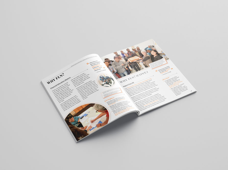
The Financial Literacy for Newcomers (FLN) program is organized by ORI to help refugees and immigrants, who are new to the U.S. financial system in Massachusetts, learn about practical finance-related matters. This pro-bono project is a collaborative work that includes me as a graphic designer, Jeff Mitchell, Lecturer in English and Former University Editor at UMass Boston (a wonderful, knowledgeable, and kind-hearted man), and Kierra Ho, Program Coordinator at ORI (thanks for all the snacks!).
The project process required multiple stages of research, revision, design thinking, and mindful editing. As for my design part, coming up with an engaging layout that would work consistently thorough the report was crucial. By working together weekly, a combination of images, text hierarchy, and graphic elements were nicely-created. Helvetica was the chosen font for readable ease, and an orange color scheme helped highlight the statistics and keywords. One of the challenges about the project was the photos' selection and quality shot that needed attentive modification to increase the relevance level with the main titles and the standard in quality. The work was delightful when our team effort paid off a great deal of helping ORI's FLN program get more funded at the end.
FLN FLYERS
FLN Flyers were a small side project along with the program's report. The flyers' design looks easeful to achieve by using essential graphic design programs such as InDesign or Illustrator. However, don't let that fool you as I sweated hard to create these flyers on Microsoft Word. You heard it correctly. The reason you may ask? When designing them, I needed to be mindful of date and time updates and language translation. Using Microsoft Word allowed Kierra Ho, the Program Coordinator at ORI, to be able to edit the info on her own and get it translated in multiple languages. MS Word was also the only program widely installed across the organization. This flexibility greatly benefited both the designer and the editor in terms of saving time and speeding the workflow. In the end, the learning curve is to adapt and work with what I have despite some technical constraints. Below are the 2020 and 2019 FLN Flyers.
CLIENT TESTIMONIAL
I have had the wonderful opportunity to work with Andy Doan since December 2018 on various design projects related to our Financial Literacy for Newcomers (FLN) Program, which is a statewide initiative to provide personal finance training to Massachusetts’ newcomers. During our collaboration, Andy has designed multiple flyers to help our nonprofit partners across the state conduct outreach about FLN to their communities. The flyers are colorful, easy to read, and overall, visually appealing. Our community partners love them!
Additionally, Andy has worked immensely on the 2018 FLN Annual Report to make it as visually captivating, informative, and unique as possible. His hard work and efforts did pay off because the report’s visual layout has impressed many people who have seen it – including those from financial institutions, nonprofits, state government, and others. In the short time that I have known Andy, I have learned that he is the type of designer who would put his all into his design projects and set high standards for the outcomes. It would be a true missed opportunity to not work with someone as talented as Andy!
Kierra Ho
Program Coordinator | Massachusetts Office for Refugees and Immigrants
Andy Doan and I worked together for several months on a major publication describing and successfully promoting FLN, a financial education program run by the Massachusetts Office for Refugees and Immigrants. Andy is a remarkably inventive designer with great sensitivity to relationships among visual, verbal, technical, and organizational problems. He’s conscientious, efficient, and good-humored—and his design work is a delight. During a long career of collaborating with designers as a writer, and often of supervising them, I’ve seldom had a more welcome professional companion.
Jeffrey Mitchell
Lecturer in English and former University Editor | UMass Boston